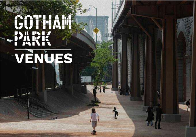
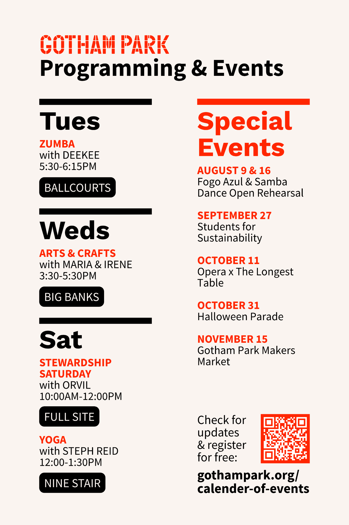
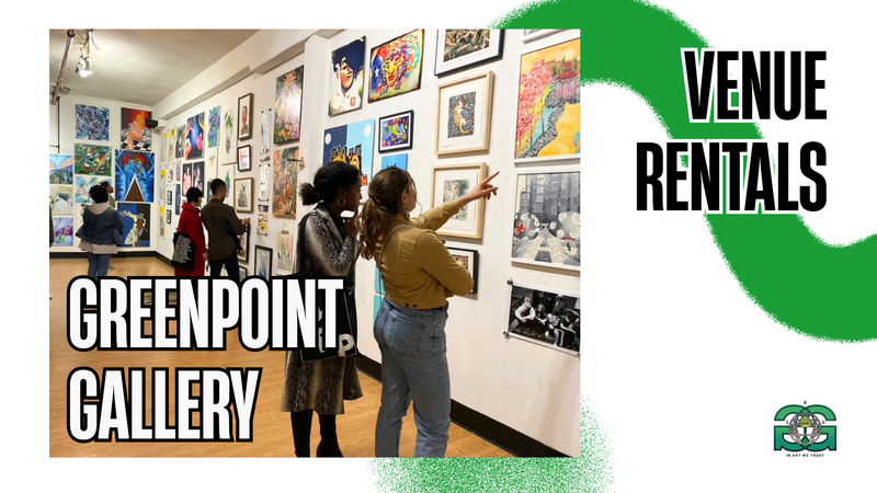
Design

Greenpoint Gallery

At Greenpoint Gallery, I worked to cultivate partnerships with press outlets, local media, and art influencers to increase gallery visibility and community reach. As part of this initiative, I developed brand positioning materials to market venue rentals, educational programming, and gallery exhibitions. Greenpoint Gallery's brand image is • Grassroots and community driven • Artist-first rather than commercially elite • Experimental, eclectic, and interdisciplinary • Educational and mentorship oriented • Nurturing and authentic, accessible to emerging artists

DCTV (Downtown Community Television Center)

At DCTV, I worked to incorporate hand drawn and painted elements into digital design and branding materials to give the marketing a more hands-on, creative community feel. DCTV's brand image is • Historic and courageous like the 1896 landmark firehouse building it operates out of • Culturally diverse and emotionally resonant; grounded in grassroots media and social impact storytelling • Artistic, celebrating creative expression • Inclusive, inviting, community oriented; welcoming across all generations and levels of expertise • Multi use: classes for children and adults, professional production services, film screenings, panels, mixers... • NYC documentary and independent film adjacent

Gotham Park

At Gotham Park, I worked to support the rebranding of the iconic Brooklyn Banks as Gotham Park, increasing its reach while staying true to its historical significance and nonprofit mission of serving the downtown Manhattan community. Gotham Park's brand image is • Urban and gritty but not grim or intimidating • Historic and iconic; one of NYC's great architectural achievements • Inclusive and welcoming for a wide audience • Like the bridge itself, big and bold • Multi use: food, events, arts, concerts, socializing, hanging out… • NYC Skateboard culture adjacent

Marketing Materials

Flyers for Instagram

Flyers for Print

Eventbrite Banners

Lost in Translation: A Design Book

After locating and photographing 20 words with meanings unknown (to me) on the streets of New York City, I settled on SCHIFO, which I originally found on a Bushwick bus stop, as the focus of my design book. Lost in Translation is an exercise in semiotics. It reimagines the word SCHIFO in original logos and promotional images that capture and translate its essence for a variety of brands and audiences.